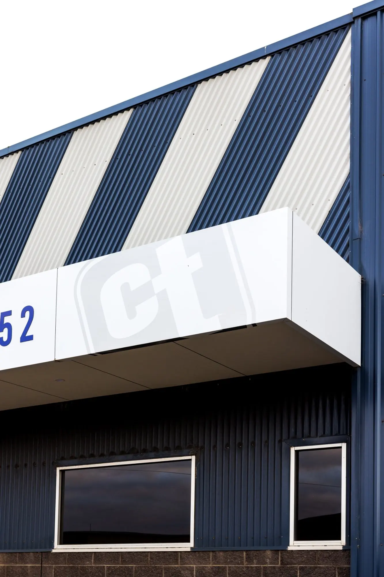
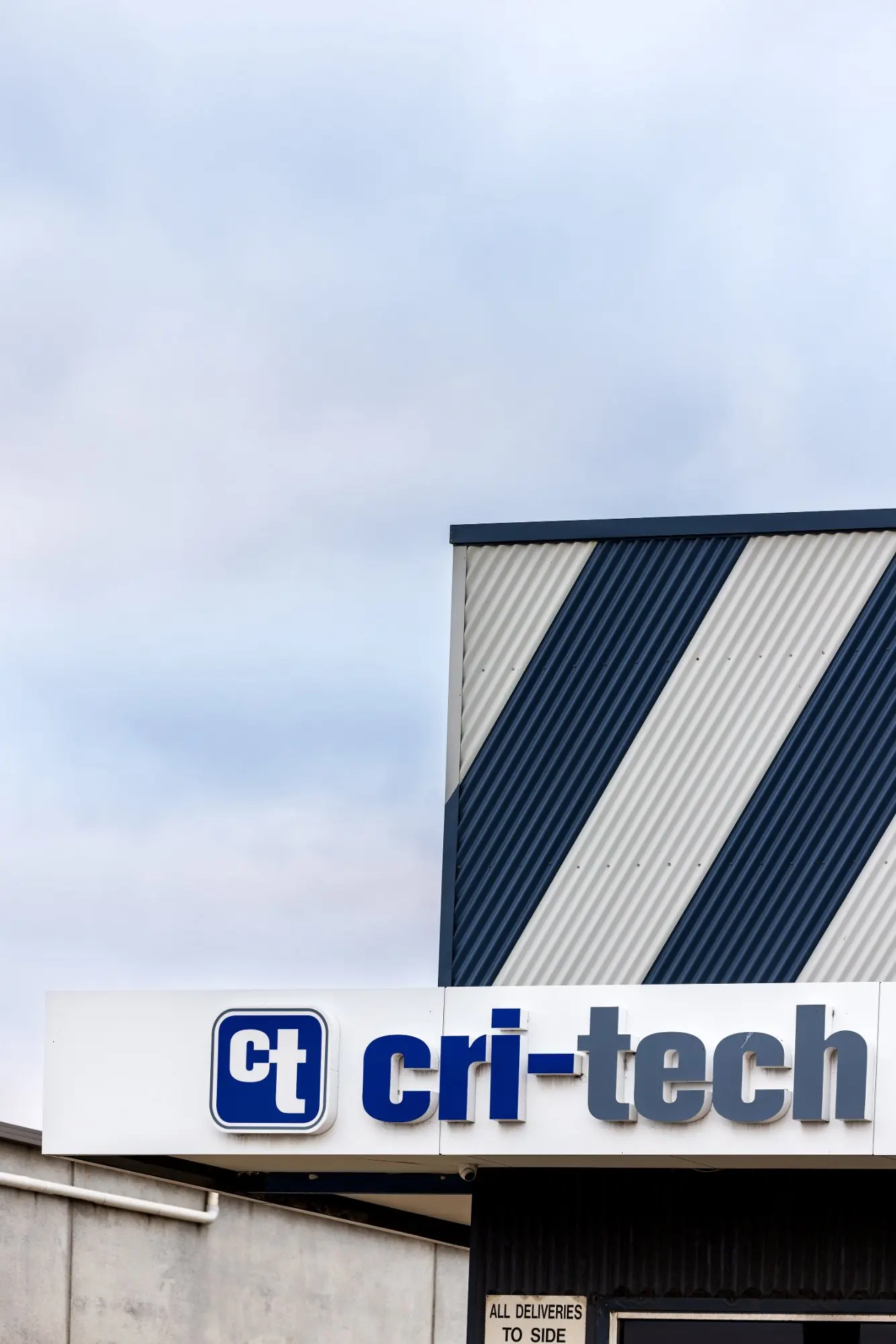
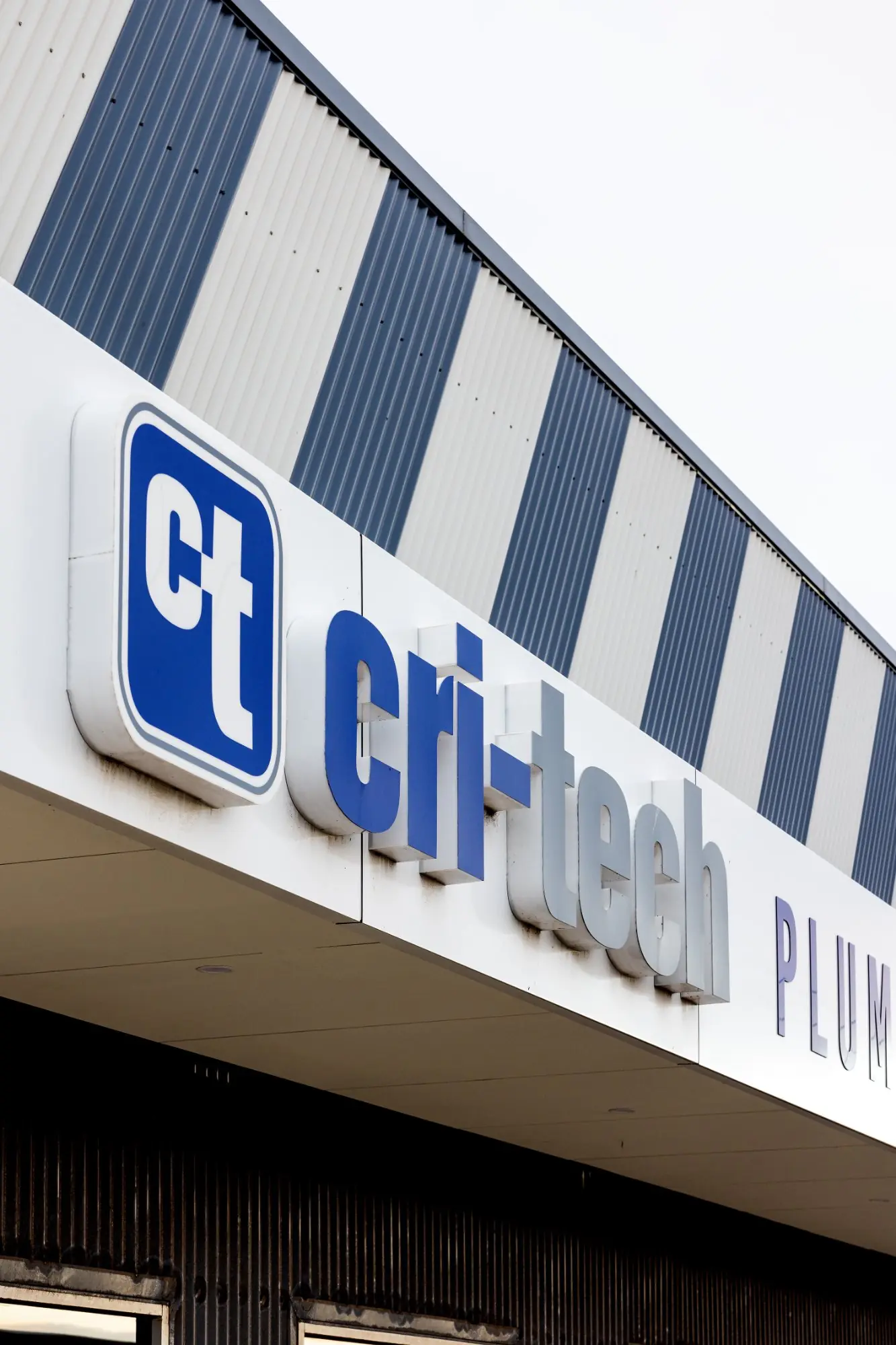
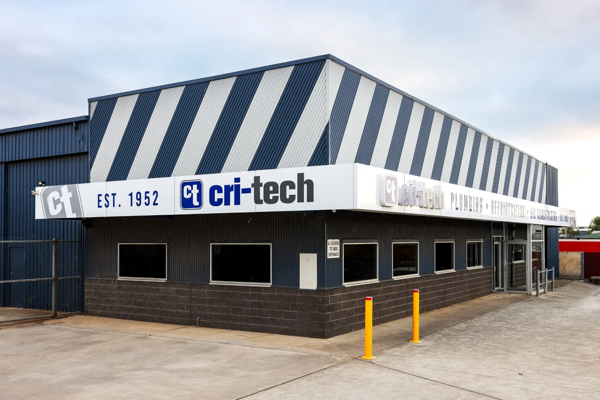
Critech’s fascia had faded and lost its edge, so we gave it a full refresh top to bottom. We reclad the tired fascia in crisp satin white ACM, then removed and refurbished the existing fabricated acrylic letters to bring them back to life. New blue router-cut ACM lettering went up alongside them, finished with metallic silver watermark logos for a bit of depth. It’s a good example of knowing when to reuse and when to renew – keeping what was worth keeping, replacing what wasn’t, and tying it all into one clean, current frontage. The building went from weathered to sharp without the cost of a full rebuild.